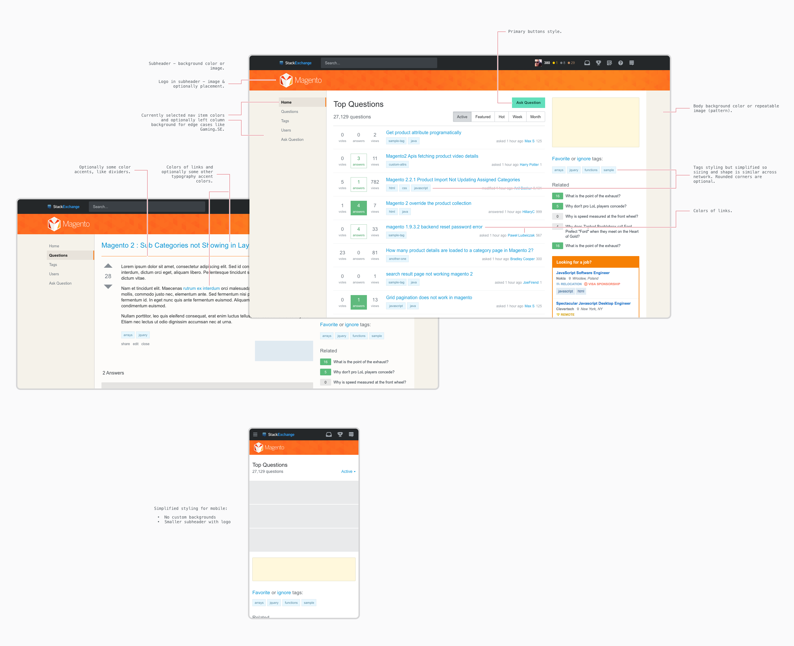
You will lose the custom graphics and custom size of the upvote, downvote, favorite question and accept buttons next to posts. The custom graphics is specific to Sci Fi SE, and there's a recolored version specific to Sci Fi Meta. I have a customization that you can enable to get the traditional vote button graphics and size, with detailed instructions if you're using Firefox.
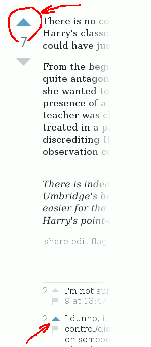
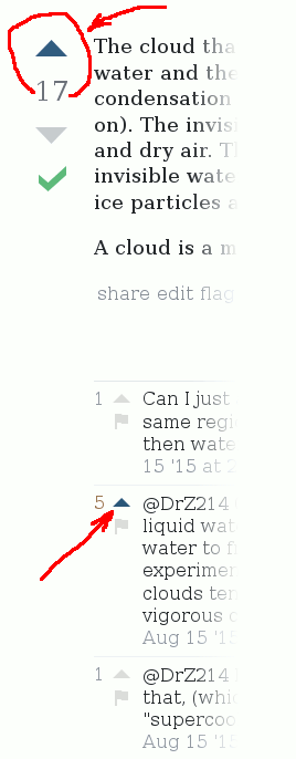
Note though that in exchange, with the new design, you gain custom recoloring of the simple triangular upvote and downvote buttons, in their active state on Sci Fi SE (but not on Sci Fi Meta).
You will also lose the per-site customized badge shapes.
You will lose the custom recoloring of certain smaller icons on the sites, eg. the icon for upvoting or flagging a comment, or the collapse/expand arrow icons used in many lists in auxiliary information pages such as the reputation changes page.
Note that in exchange, with the new design, you gain custom recoloring for some of those icons, such as the upvote comment in active state, on both Sci Fi SE and Sci Fi SE Meta, with different colors on the two sites.
Example image for the recolored buttons in the new design. Sci Fi on the left hand side, and the buttons on a typical non-meta SE site* on the right hand side.


We also gained something more important than the easily replaceable vote buttons. This is something that web designers call “responsive design”, only done well instead of abused. (“Responsive design” is a very stupid word, but its meaning isn't bad.)
Responsive design means that the design isn't tailored to one particular target user, but instead the site is customized for multiple different user environments, especially different browser window sizes, and it will detect them automatically and choose the best design for the particular user. The reason why that term gained a derogative connotation is that many web designers abused the capability for evil (this happens with almost every tool web designers get). But the Stack Exchange overlords didn't. In an unprecedented move, they actually implemented responsive design correctly. (I'm not saying that it's perfect, but it's almost impossible to get it perfect.)
To see an example for how it's done well, enable the new design, then resize the browser window to narrower, to simulate how you'd see the site on a narrow upright mobile phone screen. You will see that the right sidebar will disappear. The right sidebar is nice, but it does not contain any elements essential for navigation. You will also see that in the top bar, the search box will be collapsed to a search icon, and your reputation will disappear. Note how the search function is still available, and so is every other functionality of the top bar. You can still view your reputation by viewing your user page with the user page icon, which is still on the top bar.
Now resize your window to even narrower. You will see that the left sidebar also disappears, but its functionality is still availble in the popdown menu from the menu icon on the left of the top bar. The “StackExchange” label also disappears from the top bar.
In both of these cases, the interface has adapted for the narrower screen, but all the important functionality of the website still remains available. (Web designers sometimes use the buzzword “responsive design” for this, but they shouldn't IMO.)
This means that users who must use narrower screens, either because of vision problems (zooming the screen to very large sizes so they can read it), or because they're on a mobile phone will be able to use the site better. This is important for those users. Such web design used to be hard or impossible, but it became possible (but still hard) after some new developments in browsers.
Most websites aren't like that. They either don't use the new browser capabilities to adapt to different window size, or worse, abuse it and react to it by making the site bad. In the first kind of websites, when viewed on narrower displays, it is common to see some elements of websites overlap or disappear, so that important navigation controls will become unaccessible. (I will not link to any bad examples here.) In the second case, the website deliberately adapts to narrower screens by changing the design, but it does so by removing the interface for some important functionality of the site. (A website I don't want to name, in the name of responsive design, deliberately hid the interface option for changing your login password unless you're using a very wide browser window.)
In my eyes, these changes are much more important than the custom vote button graphics, or anything else we will lose with this update. It's a good tradeoff: while the site will become uglier for some old users, it will also become more usable for some new users who were previously unable to use Sci Fi SE for no fault of their own. I think that gaining those new users to the community is important, and if you're an established user used to the old design, please give a thought to that and reconsider this.
Keeping a website working and testing it is hard work. You can see even from the above example how you have to test the site in various unusual browsing environments. The SE designers don't have infinite time available for maintaining the site, and I think their time is better spent now than they used to be on custom backgrounds and the Orbitus font. I'm not saying that you have to enjoy the new site design, or that you personally will necessarily gain something from it. I'm not saying that the new design is perfect. But please appreciate what it will do to new users.
(I cross-posted this second part of the answer to a new Sci Fi Meta question.)
*Sorry, “typical site” is a stupid in-joke that you might not understand. I'll explain it at the risk of spoiling it. There was a certain infamous old TV ad for a washing machine chemical, which showed a side-by-side example of white clothes washed several times with their brand of chemicals versus “typical” chemicals of the same sort. I'm saying “chemical” because I'm not sure if it was a detergent or rinse aid. This ad wasn't unique, other ads of the era also compared their brand to “typical” brand. Such ads were popular targets of mocking, and gained memetic status because of that. One particular ad that said not “typical” but “new washing detergent” became actually famous, because of a parody ad done by a professional in Hungarian TV, in which the guy in the ad called something inanimate (the clothes, the bottle of washing detergent, the washing machine, I can't recall) on a challenge by addressing to it from afar as if it could respond. That a professional could do such a parody shows just how memetic those comparison ads already were.

