21

So the new theme has launched to beta and is available for testing. One of the most obvious things that is missing is that the site no longer has its star field custom image background. There is a hint of it left in the top right corner and in the footer (though not the meta footer) but overall it's missing. The reason for this is that:

They're style-able to an extent. The text in the sidebar still has to be black, so they have to be pale enough for the black text to be legible, which wouldn't be possible with the star field. – Catija♦ 16 hours ago

So, this means even going with the black at the side of the main page is a no go. However, Mathematics.SE does have a custom image and on enquiring to Catija about this in chat it should be possible to get a custom image here too:

Possibly, but probably not until after the full network rollout is done. The sidebars can be a pattern as long as it doesn't obscure the text's readability. Y'all are free to have a separate discussion about solutions for this if you want. Things like replacing the top bar black with the star field is probably easy to revert... though I'm not certain... new elements are different.

The way I see it we have a few options at this point:

  1. Stick with what we have in the new theme
  2. Try and hold out on the chance for a dark theme later on so the star field would be possible
  3. Design a new background image and see if SE will use that (this new image would have to be light though so the black text on the left nav would be readable)

What should we do here?

2
  • 5
    That's a star field? I thought my monitor was just dusty.
    – OrangeDog
    Commented Sep 24, 2018 at 11:17
  • I wouldn't mine seeing our logo blown up, made light greyscale, and positioned so that on a standard screen you see "half"ish of it on the left, the rest on the right, and then it repeats as you scroll. I can't do a mock-up rn.
    – user31178
    Commented Sep 25, 2018 at 15:10

3 Answers 3

23

Yes, we do

The custom background is one of the main things that is unique to our site and gives us our own identity on the network. Without it we look just like everyone else. Consider this answer to the linked meta:

My main gripe with the new theme is that once the site header has scrolled out of view, there is no stylistic indication of which Stack I'm on, and the only indication at all is the place holder in the search bar.

Edit: okay, and the badge shapes.

While I understand the reasons behind the changes, this is a severe loss of Stack identity.

And my comment there:

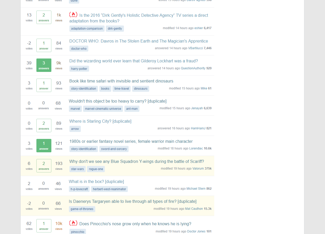
Consider this whilst having left nav hidden and the top bar not sticky. Once scrolling there are no style elements custom to our stack that are visible.

Homepage scrolled

There are no style elements on this page that tells me I am currently on SFF. We need something to be able to identify us. Now I'm not artistic so I don't have an idea of what this could look like but I'm sure once a consensus is reached here we can start designing something if that is the direction we decide to go in.


Whilst I would love our star field back, it doesn't seem possible and even accepting the chance of a dark theme that is likely to be configurable and so not everyone would use it anyway. So, in this case we would still need a light theme background.

6
  • 6
    I'm pretty sure "look[ing] just like everyone else" is the entire point of this process...
    – Valorum
    Commented Sep 21, 2018 at 9:34
  • @Valorum Not looking exactly the same though and as shown with Mathematics and Role-playing Games a background is possible.
    – TheLethalCarrot Mod
    Commented Sep 21, 2018 at 9:39
  • 5
    In the case of Maths:SE, the change is so subtle as to be almost worthless. To be frank, the fact that the text colour can't even be changed smacks of either terrible web design or a desire to standardise to an insane degree.
    – Valorum
    Commented Sep 21, 2018 at 9:40
  • @Valorum Well if we are to go down the route of a custom background we wouldn't use something so subtle, it's just there to show it is possible with the new theme changes.
    – TheLethalCarrot Mod
    Commented Sep 21, 2018 at 9:41
  • According to Catija in chat, a dark theme isn't coming any time soon.
    – SQB
    Commented Sep 21, 2018 at 14:56
  • There are other ways to make the center section unique: link text color can be changed... many sites have non-blue title/link text. Heck, it's purple on AI. We can also change the colors of the tags (yellow on Christianity and the background color of the main page area (needs to be light-colored enough for dark text to be legible on it, like the sidebar (beige on ELU.
    – Catija StaffMod
    Commented Sep 23, 2018 at 5:25
9

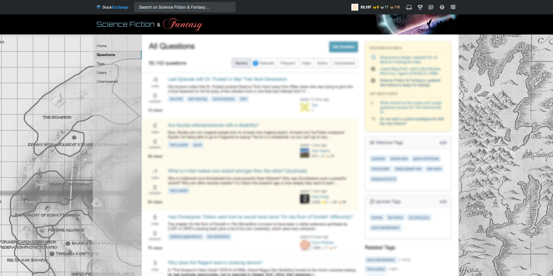
Here is a custom background idea. Split SF and F maps. I mocked a rough concept to give a general idea.

enter image description here

The good thing about this is that it reflects both sides of our community, and since its a map, we can make it light enough to make SO happy, and still have a bit of personality to it. In retrospect, I'm thinking that a version that has a sepia tone would be better then B&W, but that's something we can look into if we chose to go this route.

6
  • 5
    Both of those maps are heavily copyrighted....
    – Valorum
    Commented Sep 24, 2018 at 14:59
  • 1
    Yeah... so.... use non-copyrighted maps. This is a PoC, not a final version.
    – amflare
    Commented Sep 24, 2018 at 15:09
  • That is a neat idea!
    – Jenayah
    Commented Sep 24, 2018 at 19:17
  • 1
    But what maps would be worth using that aren't copyrighted? Commented Sep 24, 2018 at 21:08
  • There is a massive online community of map makers. So I'm sure we could find some. Or we could do it ourselves. The software certainly exists.
    – amflare
    Commented Sep 24, 2018 at 21:10
  • 3
    @DCOPTimDowd: It depends. If by "worth using" you just mean "looks interesting and detailed, without being overly busy," I'm sure that such maps exist. If you mean "shows a 'real' fantasy or sci-fi work," I'm unsure about the sci-fi side but I bet you could find a free map of Wesnoth for the fantasy half. They actually have a lot of free fantasy artwork and other assets used in the game's help system and menus (in addition to the sprites and tiles used in the game proper).
    – Kevin
    Commented Sep 29, 2018 at 1:03
0

Let's have an inverted star field with dark (gray) stars on a light (gray or white) background.

  • We (probably) can't have pure black stars on a pure white background, because then the stars would make the left nav text hard to read.
  • We can't have the original star field, because it's (apparently) impossible to make the left nav text white or to add a translucent gray background to it.
  • Using a washed-out version of the original star field would still leave a blatantly obvious discontinuity around the headers and footers. In my professional opinion as an amateur user of this site, it would look silly.
  • There aren't a whole lot of immediately obvious alternatives, so far as I can tell.
3
  • 2
    Not sure how good that would end up looking and this is a chance to redesign completely if we want. Personally I can’t see how it would still look like a star field, would probably be worth a mock-up to tell properly of course.
    – TheLethalCarrot Mod
    Commented Sep 21, 2018 at 20:20
  • @TheLethalCarrot: That's fair, but I'm not sure what alternatives exist. Your answer establishes that we want some background, but without specificity, the SE folks are not going to be able to do anything about that. In other words, if you don't like an inverted star field, then start posting alternative answers?
    – Kevin
    Commented Sep 21, 2018 at 23:01
  • I mainly wanted to establish if we wanted something first to be honest. And it’s not that I don’t like it it’s that whenever I’ve seen something like that it just doesn’t look right.
    – TheLethalCarrot Mod
    Commented Sep 22, 2018 at 7:45

You must log in to answer this question.

Not the answer you're looking for? Browse other questions tagged .