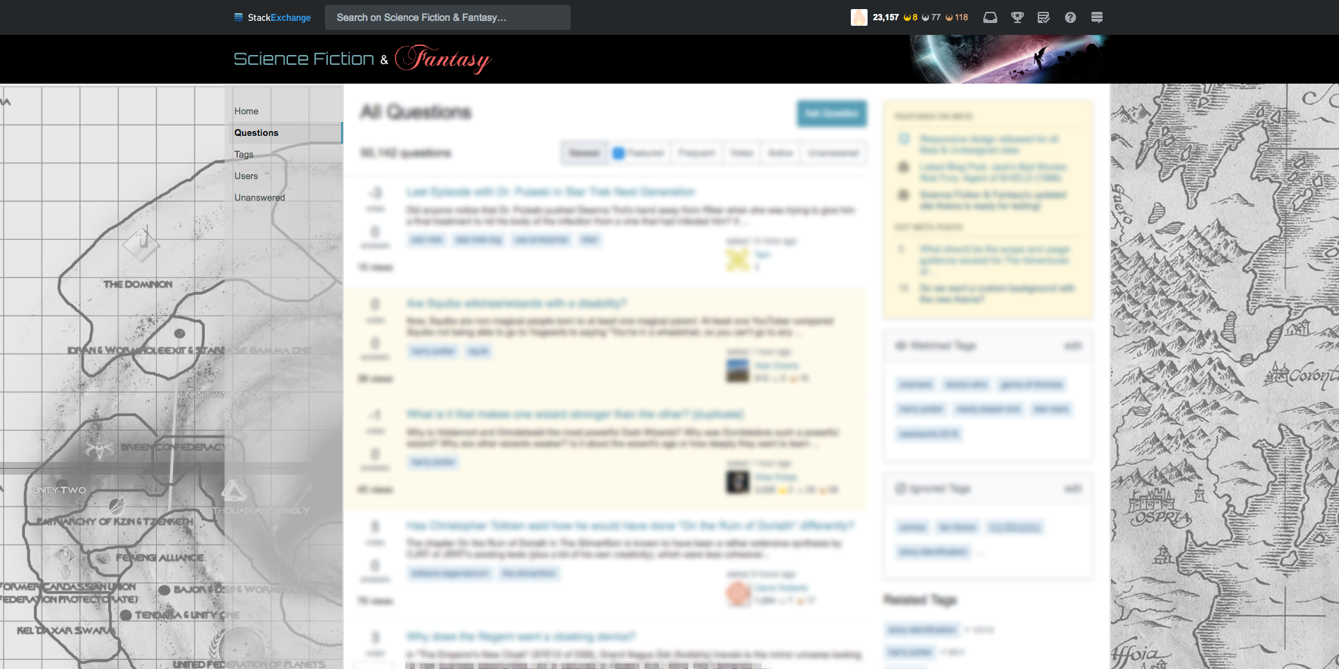
Here is a custom background idea. Split SF and F maps. I mocked a rough concept with these two images to give a general idea.
The good thing about this is that it reflects both sides of our community, and since its a map, we can make it light enough to make SO happy, and still have a bit of personality to it. In retrospect, I'm thinking that a version that has a sepia tone would be better then B&W, but that's something we can look into if we chose to go this route.

