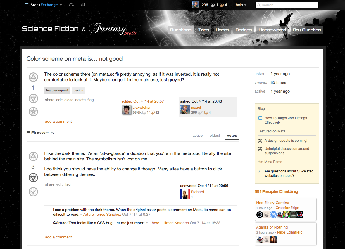
The color scheme there (on meta.scifi) pretty annoying, as if it was inverted. It is really not comfortable to look at it. Maybe change it to the main one, just greyed?
3 Answers
I like the dark theme. It's an "at-a-glance" indication that you're in the meta site, literally the site behind the main site. The symbolism isn't lost on me.
I do think you should have the ability to change it though. Many sites have a button to click between differing themes.
-
I see a problem with the dark theme. When the original asker posts a comment on Meta, its name can be difficult to read. Commented Oct 7, 2014 at 0:27
-
@Arturo: That looks like a CSS bug. Let me just report it... here. Commented Oct 7, 2014 at 18:38
-
There's nothing wrong with dark. The problem is that this is terrabad.– bjb568Commented Nov 17, 2015 at 20:37
I'll second that. The scheme has other issues (I am too lazy to look for a link, but there was a Meta question about bold text being hard to distinguish).
It's not exactly Geocities "hurts my brain" type of bad, but I strongly prefered the regular dark on light themes (even BETA vanilla one). When I used Chrome, I used a custom add-on to change the site's CSS (also discussed here on Meta a while back), but that doesn't work on FireFox.
-
2
-
Here's the "bold text" question: meta.scifi.stackexchange.com/questions/3260/…– MöozCommented Oct 6, 2014 at 2:42
-
4Boooo, keep the dark theme!– user1027Commented Nov 17, 2015 at 19:22
-
-

