31

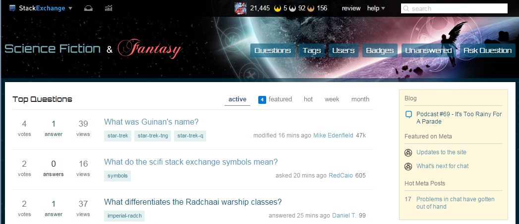
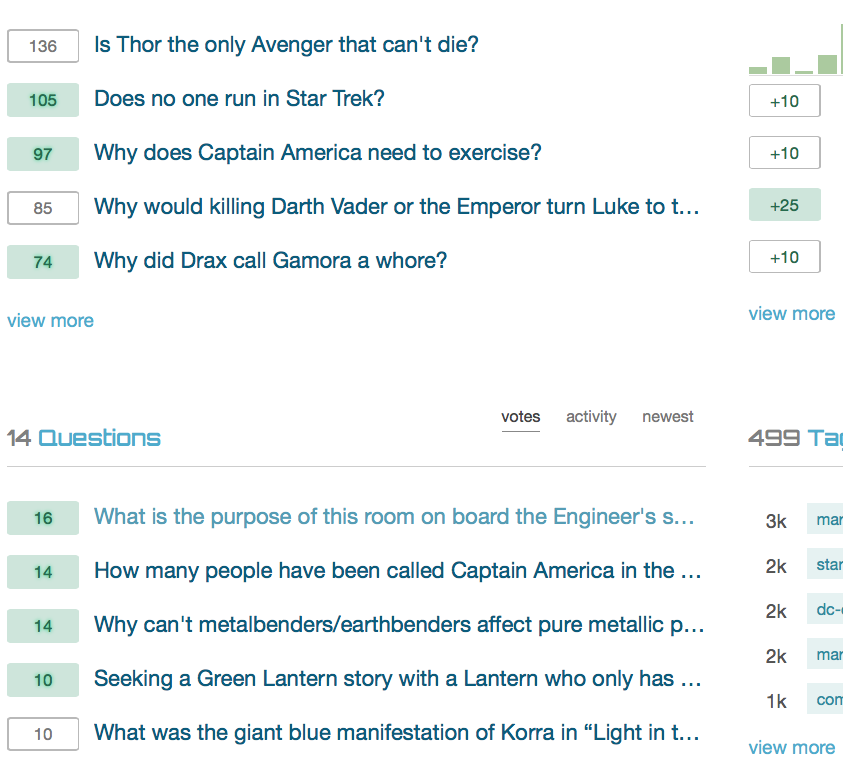
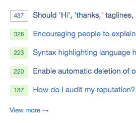
You may have noticed some updates to the design lately, they are part of a SE network-wide update to a new base css framework.

The updates allow us to:

  • Have sharper / more beautiful design on retina displays
  • Fix layout bugs
  • More easily add new features to all of our sites in the future

But more importantly, it gives you access to the new profile!

If you see any bugs please let us know in the form of answers (to this post) that illustrate one particular thing at a time.

Thanks!

19
  • 2
    Excellent, are we expecting this to be implemented in the typical 6-8 weeks?
    – AncientSwordRage Mod
    Commented Nov 17, 2015 at 8:46
  • 2
    @Pureferret I'm currently working on it, I'd like to have it online by the end of the month.
    – Stéphane Staff
    Commented Nov 17, 2015 at 8:47
  • 6
    Can meta CSS not suck pls? kthx
    – bjb568
    Commented Nov 17, 2015 at 13:36
  • @bjb568 We'll tweak meta to a light theme (white background)
    – Stéphane Staff
    Commented Nov 17, 2015 at 13:56
  • @bjb568 I'm sure it won't
    – AncientSwordRage Mod
    Commented Nov 17, 2015 at 13:57
  • 4
    @StéphaneMartin The dark background fits the site well, though...
    – Null Mod
    Commented Nov 17, 2015 at 15:27
  • @Null I was talking about the content background (which is gray right now on meta), not the actual black background with stars of the site.
    – Stéphane Staff
    Commented Nov 17, 2015 at 15:33
  • 1
    @StéphaneMartin Ah, okay. I don't mind the grey background but white should look good, too. Personally, I like the meta site's colors better than the main site's colors.
    – Null Mod
    Commented Nov 17, 2015 at 15:43
  • I'm hoping this finally fixes the CSS issues with various moderation tools on meta. There's lots of light text on light backgrounds that's been around forever.
    – user1027
    Commented Nov 17, 2015 at 16:10
  • @bjb568 Stéphane will unsuck all the cssss
    – Jin
    Commented Nov 17, 2015 at 18:28
  • 4
    guys, remember that while we may have issues with the current css, a person with feelings did do the original version. unless that person was really a time traveling robot, of course.
    – phantom42
    Commented Nov 17, 2015 at 19:25
  • 2
    It was nice while it lasted: having the profiles all on one page, and with everything easy to find. Too bad the design team got bored.
    – user14111
    Commented Nov 18, 2015 at 11:44
  • 4
    @user14111 The new profiles are better. They've split the "about me" information (which you already know about yourself) onto a different tab so you get more targeted activity information about yourself (reputation, badge progress, etc.) on one tab.
    – Null Mod
    Commented Nov 18, 2015 at 15:38
  • 1
    @Null Is there a way to default to the Activity tab when you first open another user's profile?
    – user1027
    Commented Nov 18, 2015 at 19:38
  • 1
    @Keen Requested and declined. Somebody wrote a userscript to do it, though from the comments on that first answer, it looks like you mod-people don't need it Commented Nov 18, 2015 at 19:47

16 Answers 16

17

This might not be a bug per se, rather than a criticism on the design, but it's IMHO a major issue, especially for someone used to the original design and the ideas and themes it induced and was based on.

The new design seems to significantly lack any red. In fact red seems to have entirely disappeared from it, while the original design featured red quite prominently, primarily for user links. And this prominent red-blue contrast seemed to directly fit to the logo, which contrasts the (cold) blue of Science Fiction with the (warm) red of Fantasy. In a design that already seems to overemphasize the science-fiction aspect over the fantasy aspect (which although admittedly being a bit of an afterthought in the site's evolution has still been an integral aspect of the site for nearly its entire lifetime), this seems quite a heavy change to the ideas expressed in the design.

Is there any way to get back some bits of red, maybe on the user links as before? If not, then could the reasoning for this change be made a bit clearer?

12

It's now fixed.


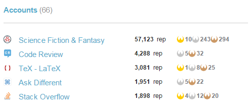
Badges in the list of other accounts are very cramped.

Here's the accounts part of my Activity tab:

enter image description here

Those badges are very tightly spaced – a bit of padding on the left-hand side would look a lot nicer.

4
  • +1. Not just in the list of other accounts, but everywhere. Look at your badges next to the icon just there! ^
    – Rand al'Thor Mod
    Commented Nov 24, 2015 at 0:17
  • that's true - they were too big. we have resized them a little so now they have additional 1-2px of padding around.
    – Paweł Staff
    Commented Nov 26, 2015 at 16:49
  • Wouldn't it have been nicer to put in some extra space rather than shrink the badges?
    – Rand al'Thor Mod
    Commented Nov 27, 2015 at 11:24
  • @randal'thor Both solutions are fine. However badges supposed to be slightly smaller than it was designed, so we decided to actually squezze them a little rather than add a padding. They shouldn't play main role here, but they supposed to be recognizable. And that's how it is right now IMO. When badges were bigger, they seemed to be a little bit overwhelming. Now it's more balanced.
    – Paweł Staff
    Commented Nov 27, 2015 at 12:36
8

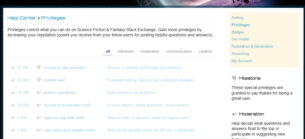
This is intended styling. If user has already gained particular privilege, then we simply fade it out a little bit.

The links on the privileges page need more contrast. They're pretty difficult to read right now.

privileges list

5
  • They're better if you haven't earned them Commented Nov 23, 2015 at 19:56
  • @JasonBaker - that makes some sense. If you earned them, you know about them from Inbox and presumably from having used them. Whereas if you didn't knowing what you have to aspire to is useful info. Commented Nov 24, 2015 at 2:56
  • DVK is right. they are faded out because you've earned them already so they can stay less readable.
    – Paweł Staff
    Commented Nov 26, 2015 at 15:52
  • 3
    So because I'm less likely to need/want to read it, you make it harder to read? That seems silly.
    – phantom42
    Commented Nov 26, 2015 at 16:03
  • 1
    @phantom42 it's not wikipedia where it's more possible to read the same article twice. Think about this more as a todo list. So when you, for example, wash your dishes, you just cross it out from your list.
    – Paweł Staff
    Commented Nov 27, 2015 at 12:42
6

This is intended styling to stay consistent with Network.

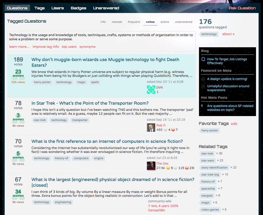
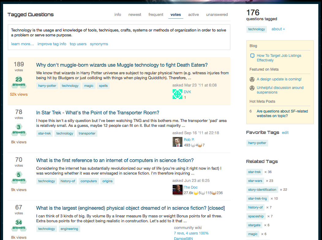
In the old design, the community bulletin and questions with my favorite tags were having the colorscheme-matching design (though the bulletin meta icons could be hardly seen):

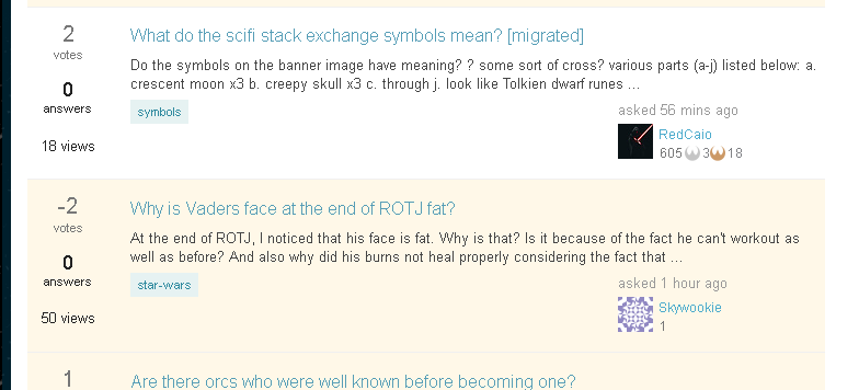
With the new design (which seemingly is going to be live by the end of november), the icons are fixed, but bulletin background and the questions which have my favorite tags got the yellow background, doesn't really look good.

Could this be reverted to the blueish, please?

7
  • We now use yellow for favorite questions and the community bulletin, it has to be consistent throughout the network for a better experience for the users (things doesn't change anymore from one site to the other).
    – Stéphane Staff
    Commented Nov 17, 2015 at 19:26
  • 3
    @StéphaneMartin You do have different overall color scheme for each site (excluding betas which all have the same simple one), and it doesn't confuse the users, does it? The change in color doesn't seem to be critical then...
    – nicael
    Commented Nov 17, 2015 at 19:36
  • @StéphaneMartin does this mean that the CSS class names are consistant across all stacks? So I can apply one user CSS to change the yellow to something less jarring and it'll work on all sites at the same time? cuz that will be awesome.
    – KutuluMike
    Commented Nov 18, 2015 at 13:38
  • 1
    @MikeEdenfield Yes it's the same css classes
    – Stéphane Staff
    Commented Nov 18, 2015 at 13:39
  • @MikeEdenfield I'm pretty sure I've seen meta posts asking how to use another site's CSS on scifi. From what I recall, a few lines of JS do the trick.
    – user1027
    Commented Nov 18, 2015 at 15:38
  • @Keen I've see that as well, but if the new theming is going to be consistent across all sites, that also means I can apply the same customization across all sites and get similar results, which is good news.
    – KutuluMike
    Commented Nov 18, 2015 at 17:36
  • I agree this is not a subtle enough difference between unhighlighted questions and highlighted ones. I can barely see the difference. Do not like! Commented Nov 23, 2015 at 16:13
6

It's now fixed and will be live after our next production build.


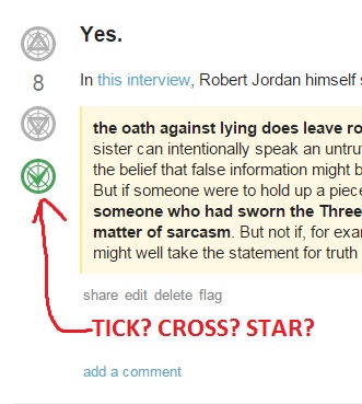
The green checkmarks for accepted answers have become unclear as a result of the background lines becoming bolder and more defined:

screenshot

The same problem exists with the upvote and downvote arrows, but they're not quite as bad (IMO). Would it be possible to change them back to how they looked before, with the background lines being much weaker so that it's clear that thing is a tick?

This is especially important for new users. When they're not used to the site, they may not know about the practice of accepting the correct answer, and it's much easier to ask them to "click on the checkmark on the left" than "click on that grey patterned circle below the vote count - no, not the downvote button, the one below that".

1
  • 1
    I agree. While I know what these buttons are they seem too busy now. Could easily confuse others.
    – Matt
    Commented Nov 28, 2015 at 5:22
4

It's now fixed.


Badges on the profile look a bit cramped.

Here's a pair of badges from my profile page:

enter image description here

I think the badges look a little cramped, and would benefit from a small about of padding on either side. Here's a mockup of what that might look like:

enter image description here

1
  • Most likely related to the other issue you raised as it uses the same icon set for badges.
    – Robotnik
    Commented Nov 26, 2015 at 5:25
4

It's now fixed.


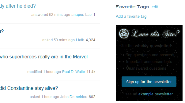
The newsletter ad is barely readable:

enter image description here

2

It's now fixed


When sharing a link to an answer on meta.scifi.SE, the answer fades to black before "snapping back" to white.

To see what I mean, please click this link to the meta answer that I first noticed it on.

Presumably, this fade to black was great when the site was darker in colour, but with the new style is simply looks broken.

Edit: As per comments, this "black fade" effect happens in multiple areas of the site, including "show more comments", making a new post or using a link to go to a comment. An example of the comment one is here.

3
  • 2
    By the way, this holds for all fade effects, including "show more comments" or making a new post.
    – TARS
    Commented Nov 23, 2015 at 10:49
  • This black fade effect is purely annoying at best Commented Nov 23, 2015 at 10:54
  • @TARS And direct links to comments. Commented Nov 23, 2015 at 11:02
2

This won't be updated.


The site name has become too small:

enter image description here

The title "Science Fiction & Fantasy" used to be bigger; now it's hardly any larger than the "Questions", "Tags", etc. buttons, yet there's still a lot of space on three sides of it. What's the reason for this change in size?

Cf. e.g. the English SE, where the site name is MUCH bigger than the "Questions", "Tags", etc. buttons.

1
  • 1
    actually, as far as I know, logo has the same size as before. It is still easily readable, so we're not going to change the size. it's also quite big anyway.
    – Paweł Staff
    Commented Nov 26, 2015 at 15:34
2

This won't be fixed. It has to stay consistent with entire Network.


"Favorite" tagged questions are highlighted with very-pale-yellow background. May be it's just me but it seems too pale - you can barely distinguish it from regular question's white background. Is that something specific to SFF and if so, can it be fixed?

enter image description here

4
  • This color is consistent across whole network, so we'd like to keep it as it is. Although, we know it's not the most beautiful shade of yellow (or orange) so we may want to updated it in future.
    – Paweł Staff
    Commented Nov 26, 2015 at 15:39
  • @Paweł - to be honest, I don't mind it aesthetically. It's simply harder to distinguish from the non-favorites, doesn't stand out much. Original design had much more difference between the two. Commented Nov 26, 2015 at 15:47
  • i've got your point and you might be right. that's why we gonna take a closer look at this across whole network. if we change something that affects whole network, it has to take some time because it's always huge change (even if it's one color in CSS) and we need to test everything very carefully.(and we still fail sometimes.. :))
    – Paweł Staff
    Commented Nov 26, 2015 at 15:50
  • 1
    @Paweł - Testing? What's that? Quality Assurance issues are best solved with a Batleth. :) Commented Nov 26, 2015 at 15:53
2

Issue with a moderation tool:

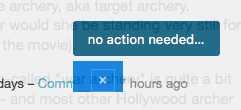
I just handled a flag for a post with many comments. When I clicked the 'move comments to chat' button, I get this useless little overlay:

overlay with just a close button

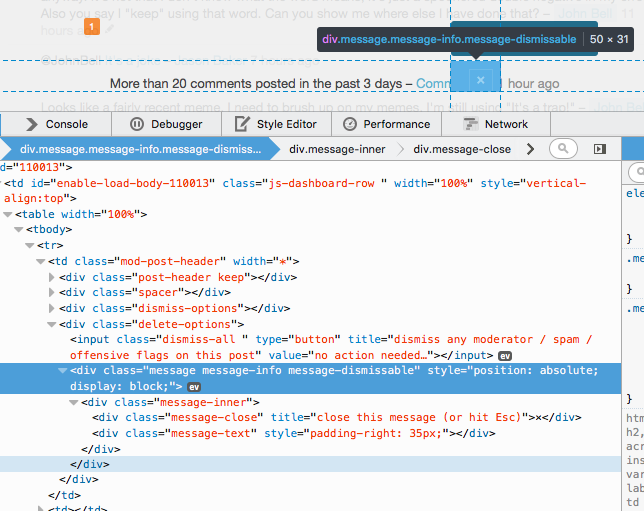
Inspecting the element shows there's no text in the overlay, which seems odd.

overlay element, inspected

Not sure if this is the new design or an underlying bug. I think that overlay is supposed to have a link to the chatroom in it.

Steps to reproduce:

  1. On Mac OS X Yosemite running Firefox 42.0, notice a 'post has 20 comments flag' and navigate to the post's page.
  2. Click the 'move comments to chat' button.
  3. Observe little blue overlay.
4
  • hmm.. i can't actually reproduce this.. could you share some more details or biggers screenshots too?
    – Paweł Staff
    Commented Nov 26, 2015 at 17:32
  • @Paweł I added more details of my workflow, but I can't really get better screenshots until I get another one of these flags.
    – user1027
    Commented Nov 26, 2015 at 18:12
  • 2
    @Keen Are these flags raised automatically when a post has 20 comments? I'd be happy to put loads of comments on something ... you know, for science.
    – Rand al'Thor Mod
    Commented Nov 27, 2015 at 0:52
  • @Paweł I just added another screenshot, hopefully it helps.
    – user1027
    Commented Dec 10, 2015 at 20:15
2

The RSS link for a given tag runs into the right sidebar.

To replicate this, go to any the question list for any tag. It is particularly evident on a tab without many questions to display, where it overlaps the text in the sidebar.

For example, the unanswered questions tab for

overlapping text

2
  • thanks for reporting this. it is a bug indeed, across whole network. we will fix it.
    – Paweł Staff
    Commented Nov 27, 2015 at 12:49
  • We've pushe a fix. This should be resolved now.
    – Kurtis Beavers Staff
    Commented Dec 13, 2015 at 23:56
2

It's now fixed, it'll be live after our next production build.


Long usernames run over the users information card on questions.

SS-3.1415926535897932384626433 has a username with an allowable length in the system, but the username runs out of the styled div.

When the user name belongs to the asker or answerer, the result is cramped text.

long username as asker

long username as answerer

When the user name belongs to the editor of a post, it runs over the information of the original author.

long username as editor

1

This is a broad issue I have with the new design: The design on the main site and meta are too similar. In the old design, I could tell at a glance if I was on meta or the main site because of the wildly different color schemes.

It looks like the main differentiator between main and meta is the top banner, but that's a pretty minor difference, and it vanishes if you've scrolled down a bit. Once you've scrolled down enough to see the question and answer bodies, there's no big indicator that you're looking at meta vs main. It looks like the colors between the two are ever so slightly different. The text on meta looks a little lighter to my eyes when I do a side by side comparison. But there's no way I can keep track of that minor difference to keep track of which is which.

1
  • Well, for one all the links are yellow vs blue afterall. It seems to give quite a different overall color impression.
    – TARS
    Commented Nov 30, 2015 at 16:57
0

Progress towards tag badges on my profile aren't updating.

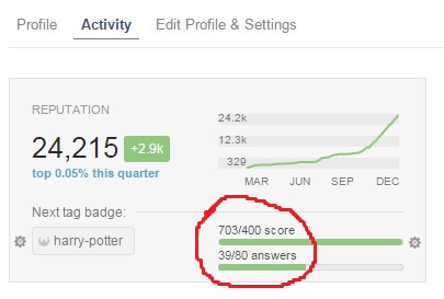
Several days ago I set my target tag badge to be the silver badge, and ever since then my progress towards it has shown as exactly the same, even though I've posted a few answers since then:

tag badge progress

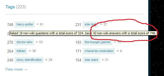
These numbers have been stuck on the same figures for a week or so now, even though the numbers shown on my Tags tab are different:

tag scores

Surely this is a bug. On other Stacks I've been active on since the new profiles came out, the scores in the tag badge progress box updated at the same time as the scores in the Tags tab: daily. But here they're not updating daily or even weekly, and I suspect they may not be updating at all.

4
  • 1
    Maybe it only counts good answers :-P
    – Valorum
    Commented Dec 6, 2015 at 17:33
  • @Richard Cheek! :-)
    – Rand al'Thor Mod
    Commented Dec 6, 2015 at 17:39
  • I've been noticing something similar; the badge I'm currently tracking is updated fine (I just posted a LoTR answer, and my answer counts were updated in both places basically instantly), but others are not; I posted a Star Wars answer last night, but the badge tracker and tag list haven't updated to reflect it.. On the other hand, I also posted a Doctor Who answer last night, and that tag updated fine Commented Dec 12, 2015 at 17:09
  • @JasonBaker That's strange; it seems to have been fixed for me now. I was going to delete this answer, but if you're still having the same problem, I'll leave it until we hear from one of the Devs.
    – Rand al'Thor Mod
    Commented Dec 12, 2015 at 21:13
-5

The new accept colors remind me of zombies, especially the faint text shadow:

The ones used currently on Meta Stack Exchange would go better there:

3
  • 7
    Disagree, I think the Meta SE accept green is too bright for SFF.
    – alexwlchan
    Commented Nov 18, 2015 at 8:30
  • @alex I agree; mainly was just stating that the new color is creepy.
    – nicael
    Commented Nov 19, 2015 at 13:08
  • 3
    But ... zombies are on-topic!
    – Rand al'Thor Mod
    Commented Nov 24, 2015 at 12:45

You must log in to answer this question.

Not the answer you're looking for? Browse other questions tagged .